Responsibility: Colorist
Design Brief: generate excitement for our promotional campaign through contrast and color.
Art.ly is an Esty-esque online store whose goal is to “deliver handmade items to people who will cherish them”. Art.ly wants to showcase its ability to brighten up any living space with its handmade products from its website.
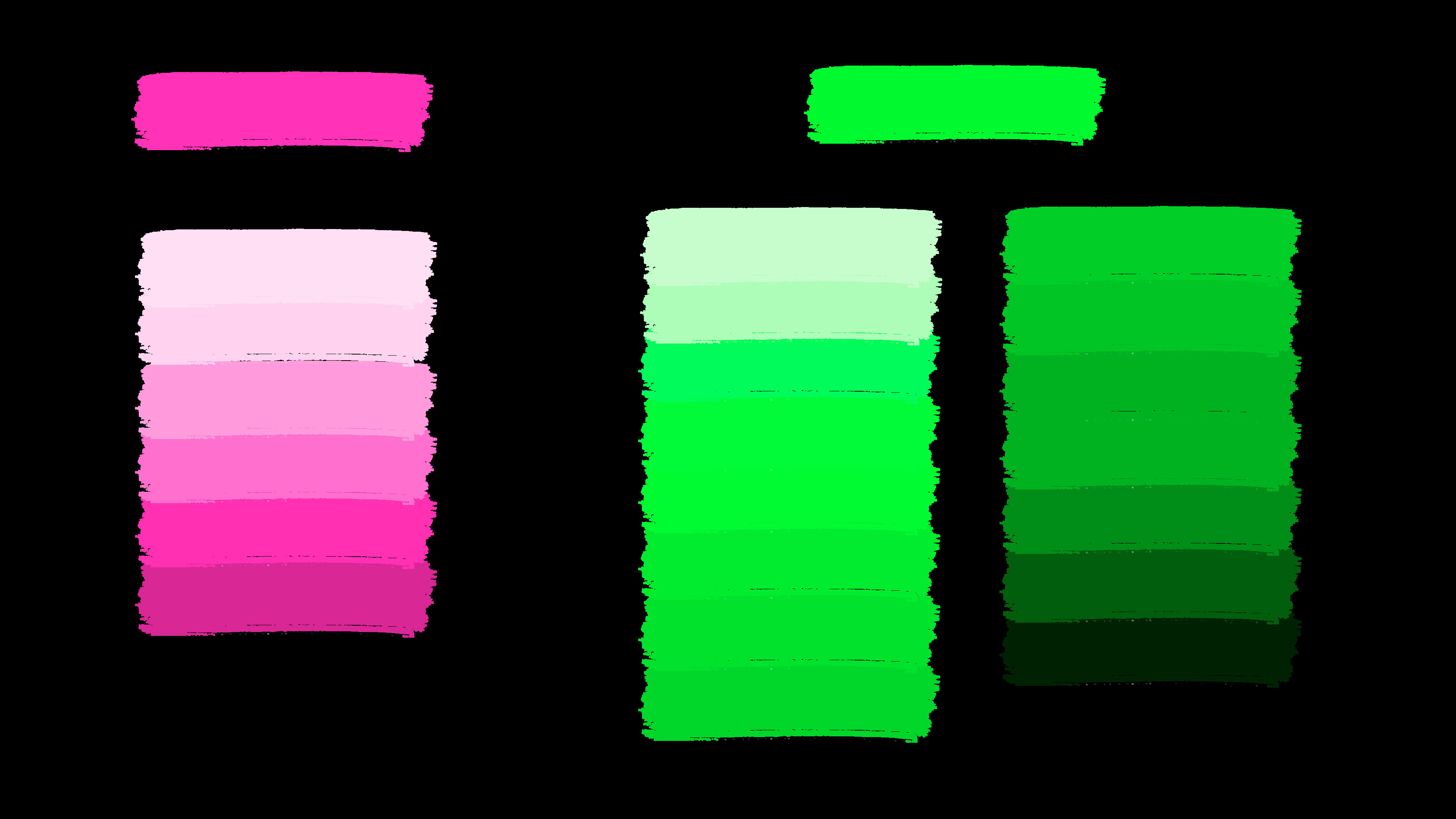
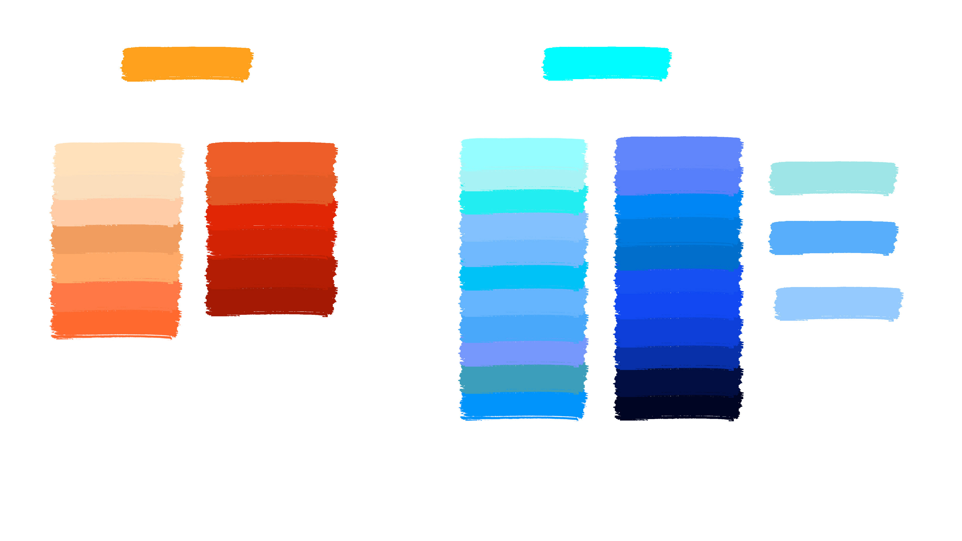
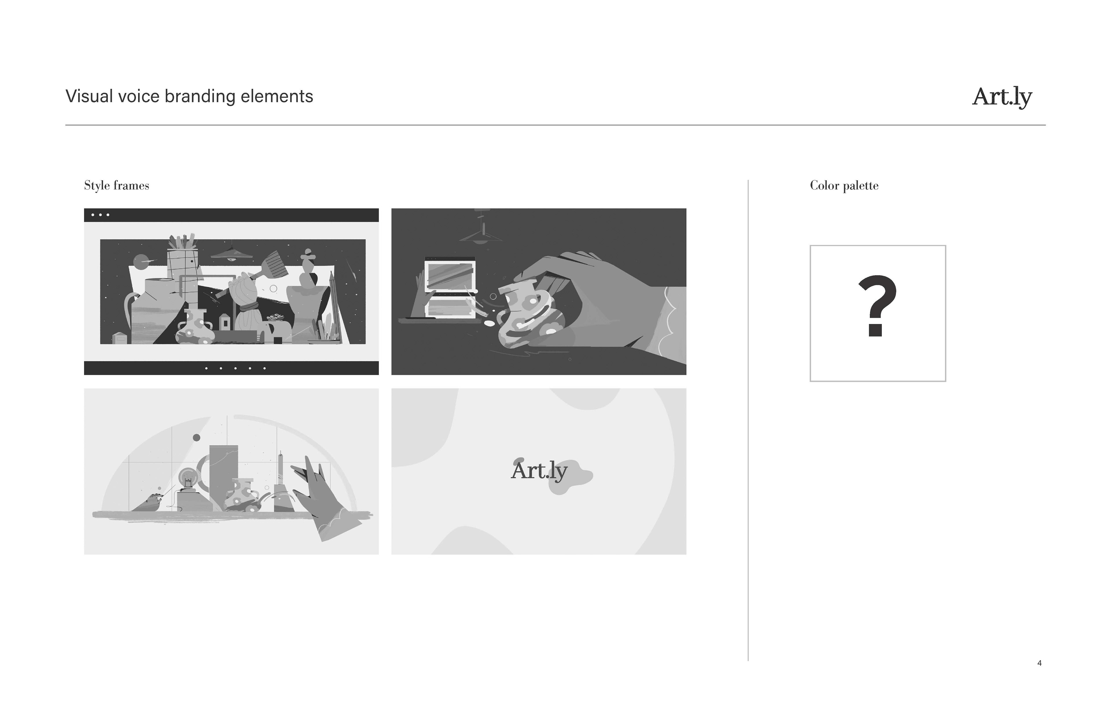
Color Palettes
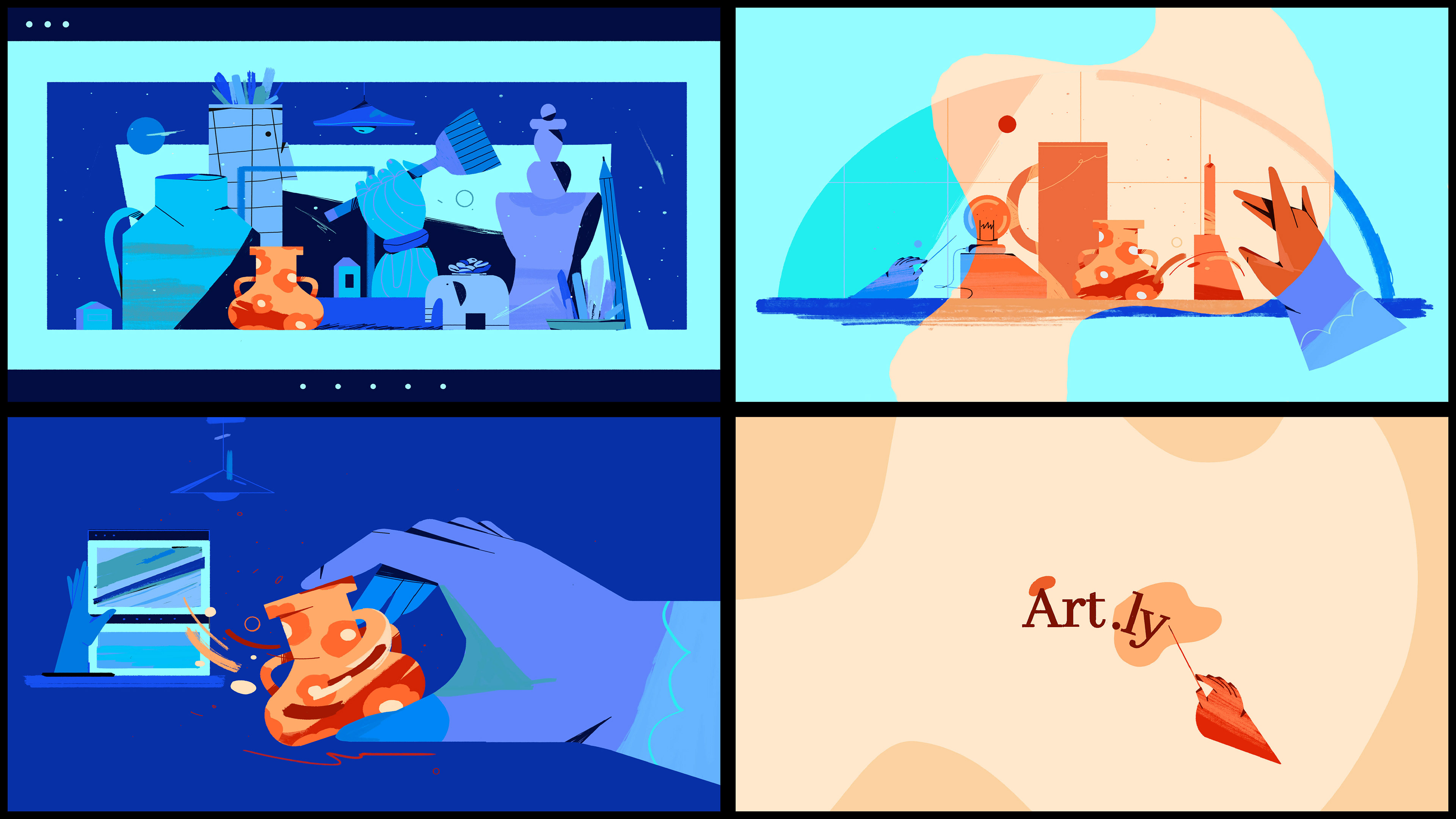
To illustrate the potential of Art.ly’s products to bring warmth to living spaces, two different color palettes were developed: a warm palette for the Art.ly product, and a cool palette for the pre-Art.ly product living space.
An orange/blue complementary palette would illustrate this message the best because blue is one of the coolest colors available to us (temperature-wise), and orange is an extremely warm color without being overwhelming (in my opinion).
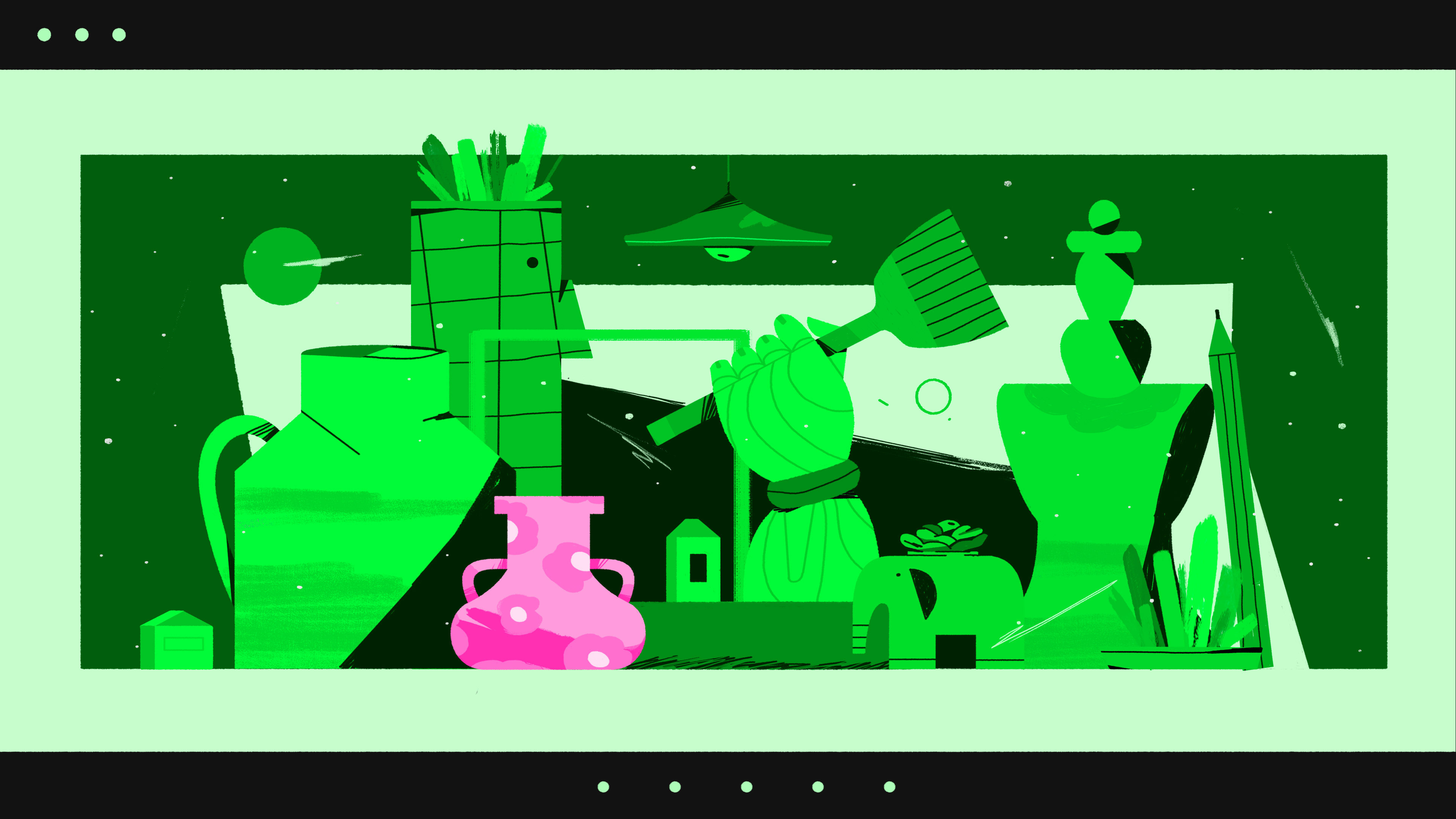
The colors used were found by matching the K values to each shade of gray in the frames given by Art.ly (frames were given in grayscale).
Branding Guidelines/Instructions

Ideation/Alternative Combinations